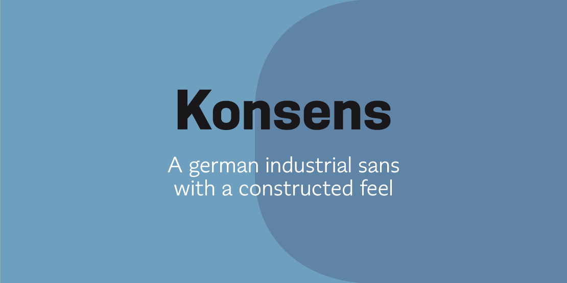


Konsens
ArtikelID: 46 | seoTitlePre: | nameArticle: |basePath: /var/www/virtual/modula-shop-systems.de/modula-cms.de/hubertjocham.dev/htdocs
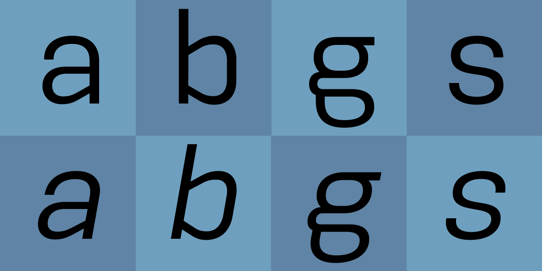
Germany has got a strong heritage of industrial typefaces. These fonts feel like being constructed by engineers. The shapes look like they have been built with circles and squares. DIN Mittelschrift is one very famous example, or the font on the old german car numberplates. Since the »Romain du Roi« we know that it is tricky to draw a geometrical typeface. For optical reasons you have to go away from circles and lines with exactly one weight. Therefore the aime is not to construct a typeface but to draw it the way it feels constructed.

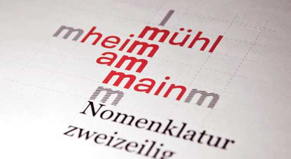
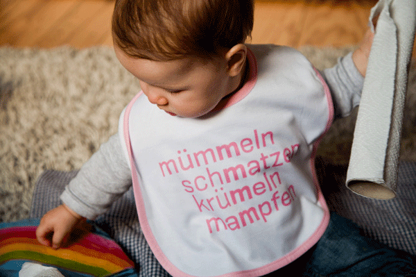
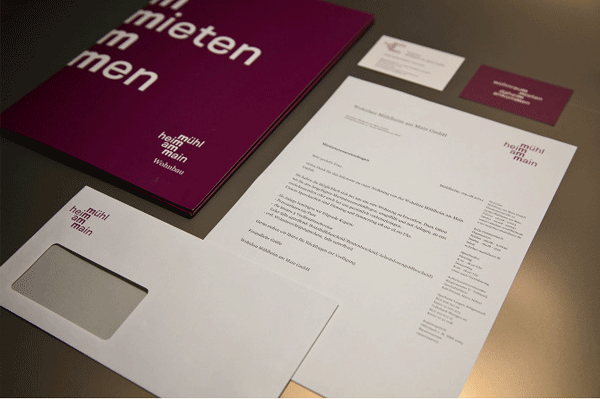
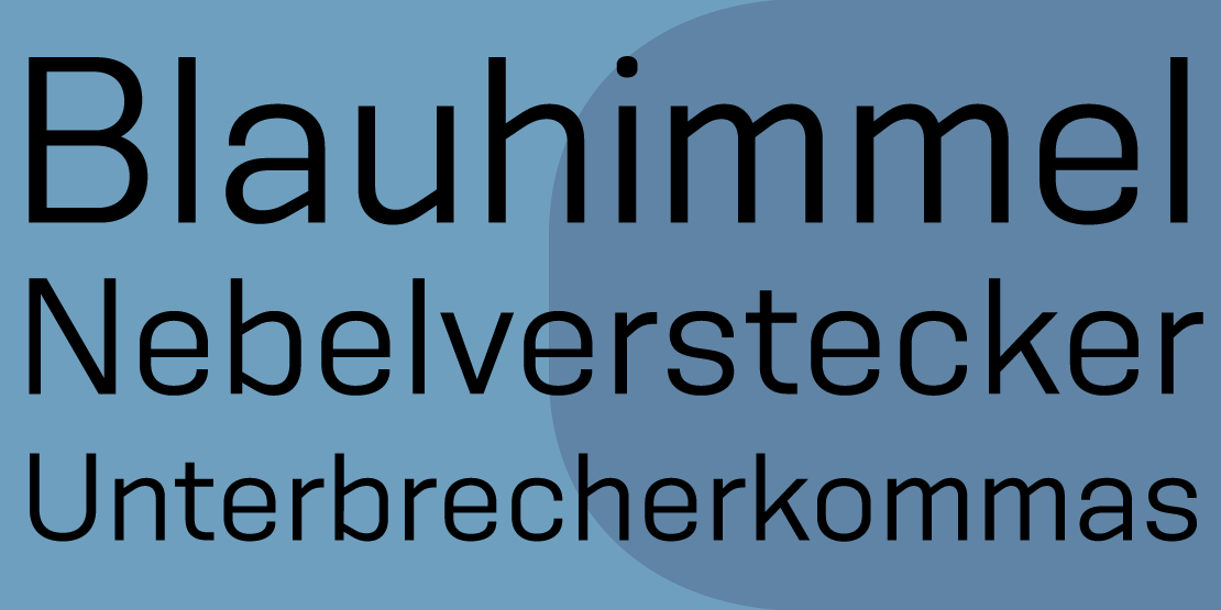
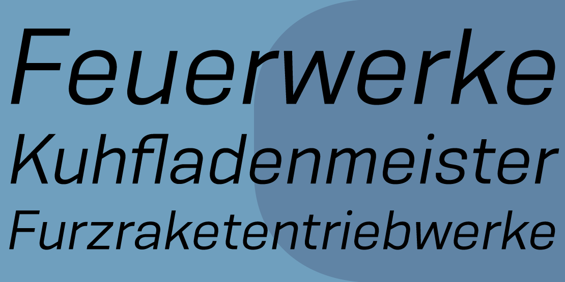
Konsens is not constucted at all. The design of a typeface is like stage production. Like stongly made up acters the characters of a typeface must be superrelevated, to be very clear in there seeming. Particularly in small sizes. Konsens has got 9 weights from Light to Ultrabold with italics like most of my other families.
Konsens is not constucted at all. The design of a typeface is like stage production. Like stongly made up acters the characters of a typeface must be superrelevated, to be very clear in there seeming. Particularly in small sizes. Konsens has got 9 weights from Light to Ultrabold with italics like most of my other families.

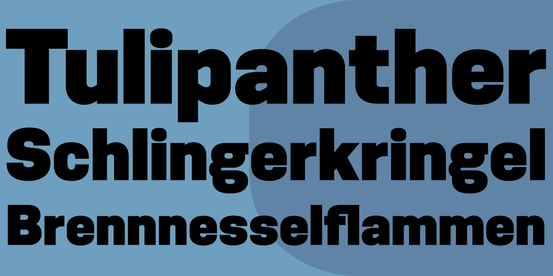
In addition to that, there is a stencil headline companion. It also has got 9 weights but no italics.

In the standard set the main figures are tabular but with a proportional old style figure set as a feature.

Traditional and stylistic ligatures are also part of the feature set.