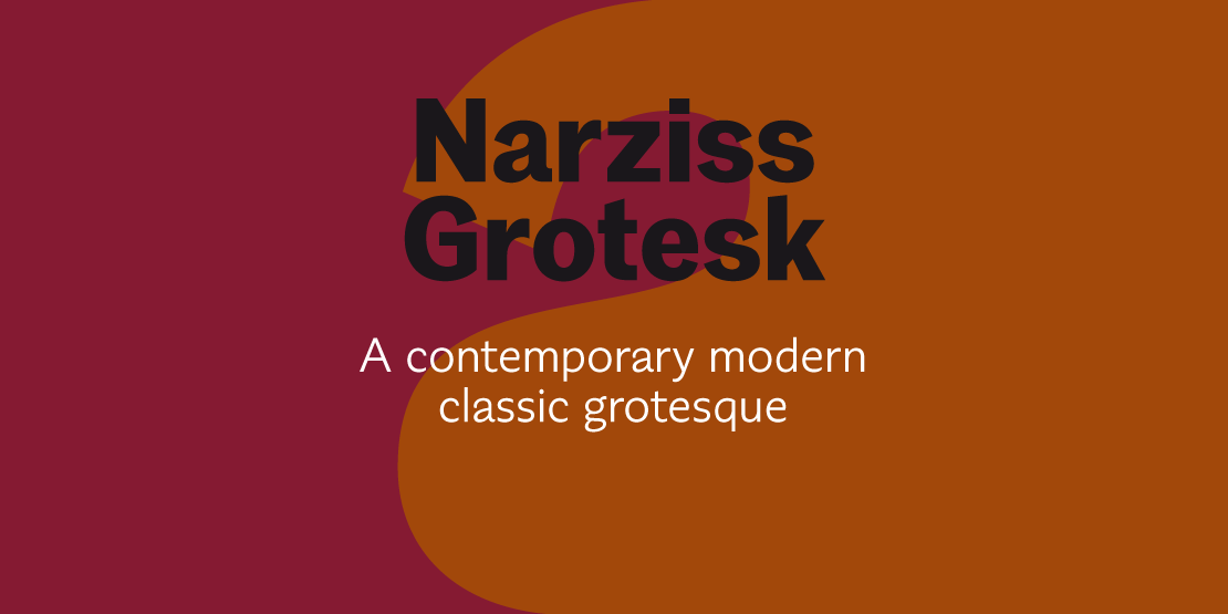


NarzissGrotesk
ArtikelID: 85 | seoTitlePre: | nameArticle: |basePath: /var/www/virtual/modula-shop-systems.de/modula-cms.de/hubertjocham.dev/htdocs
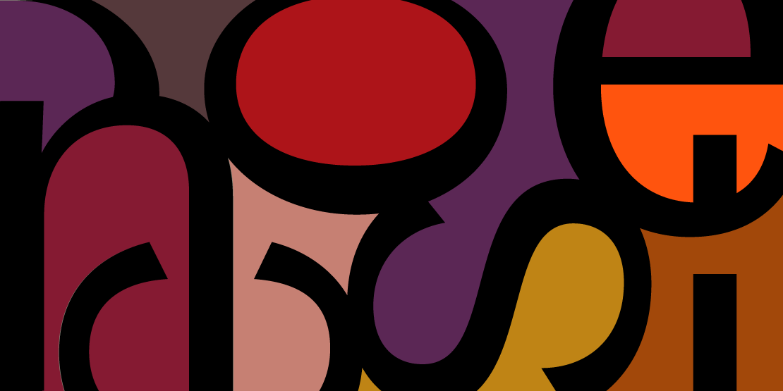
All of you will know my neoclassic typeface Narziss. You can find it in headlines all over the world. Creating a sans serif version did not mean, that I will just take away the serifs and thicken the hairlines. I decided to make a major step. Back in 1998, when I was working for Arena magazine, they used Venus. One of the interesting digital versions of a classic grotesque. It worked perfect for a lifestyle magazine.

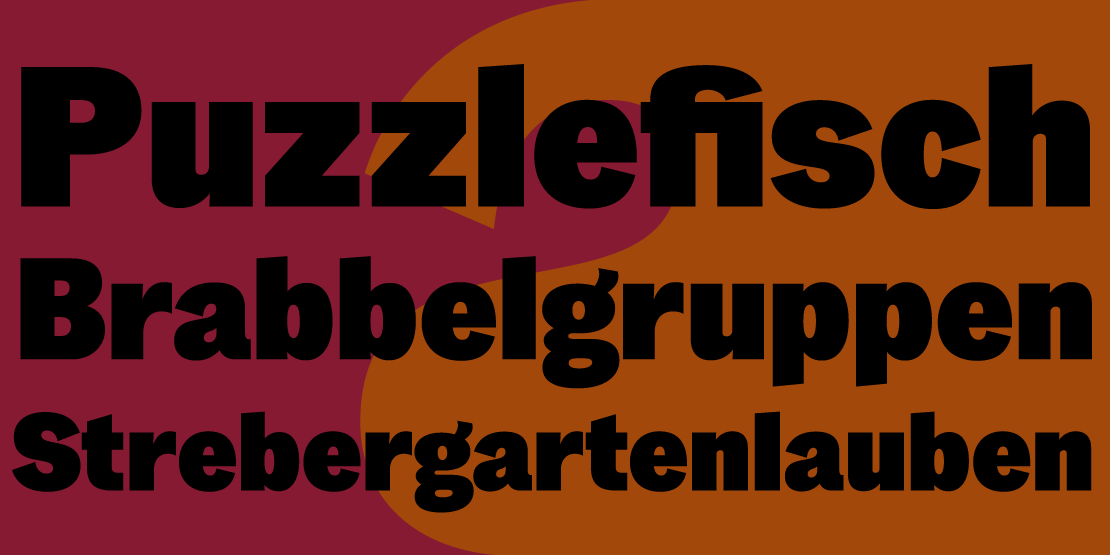
So after some experiments I decided to create NarzissGrotesk in a similar way. Inspired by 19th century grotesque specimen and of course by the Narziss family. Some magazine art director friends went into testing and really liked the way it works in different sizes. Available are 9 weight with italics from Light to Ultrabold.

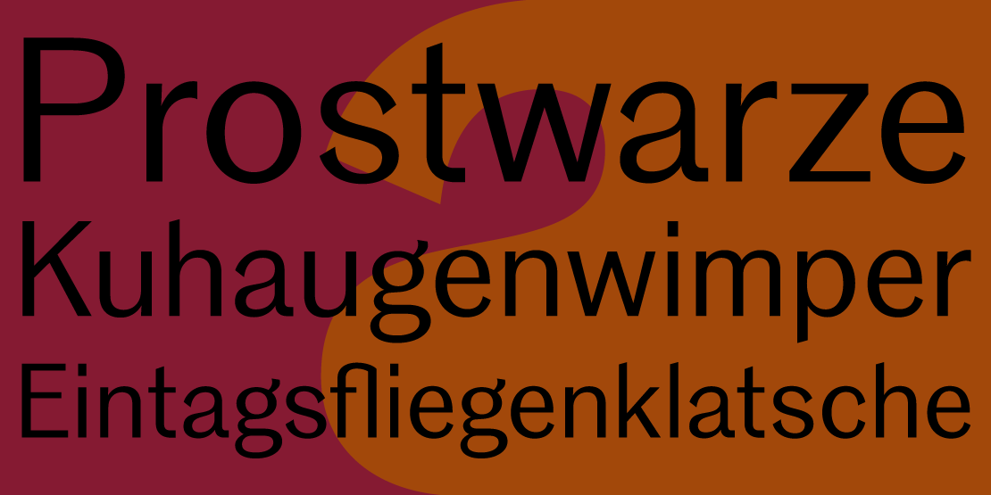
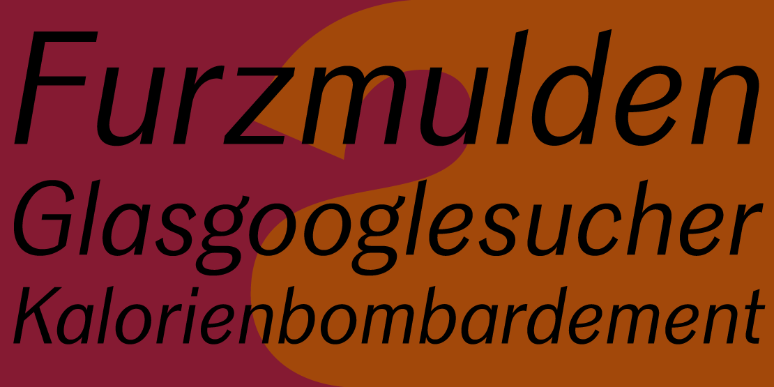
The capitals are clearly based on the model of a 19th century grotesque.

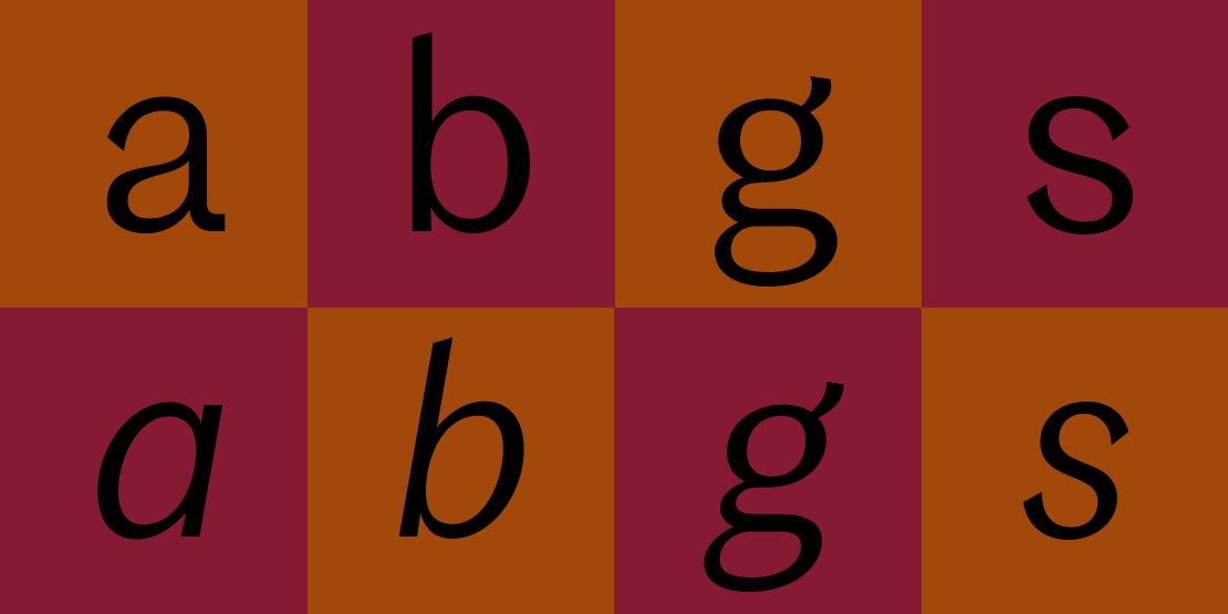
In the standard set the main figures are tabular but with a proportional old style figure set as a feature.

Traditional and stylistic ligatures are also part of the feature set.

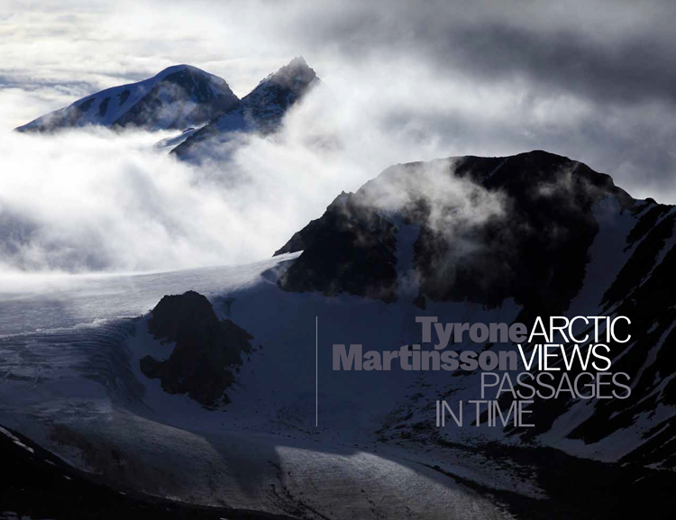
Phonebook designed by my friend Martin Farran Lee