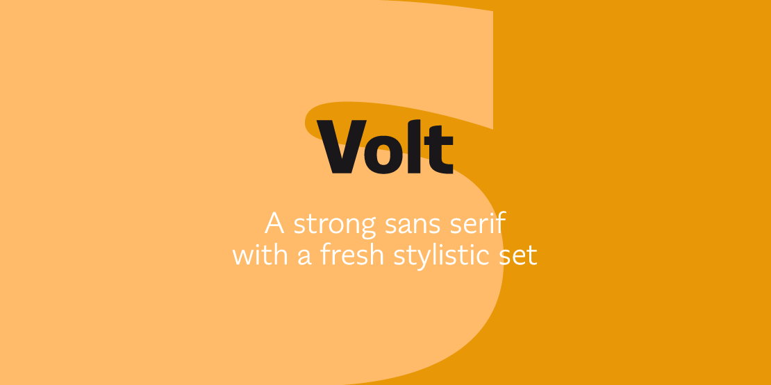


Volt
ArtikelID: 37 | seoTitlePre: | nameArticle: |basePath: /var/www/virtual/modula-shop-systems.de/modula-cms.de/hubertjocham.dev/htdocs
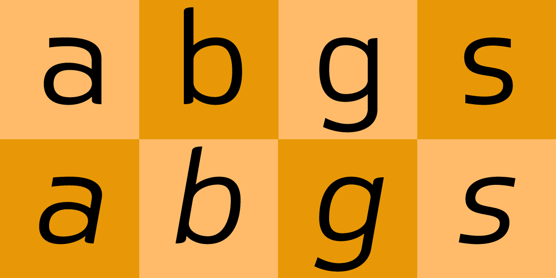
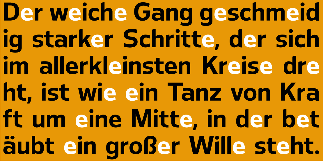
Volt is a concept I have carried with me for quite a some time. Starting with only the alternate version it did not work as a useful sans serif. So I had to narrow it down to a more conventional basis with a full vertical stroke at the letters a, b, d, g, m, n, p, q, r and u. The curved endings follow the form of the round parts. I only added them where they cleared the situation.

Only a few near the baseline and some more at the ascenders and the upper part of the x-height. In some elements you feel the classic penstroke.

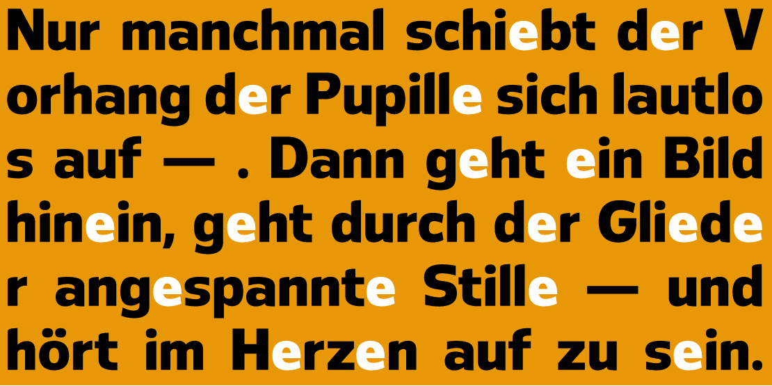
Volt is basically built on this idea. I tried to give letters like the »n« a certain dynamic by keeping the left upper part quite low and the right upper part quite high. It follows the classic penstroke. By skipping the »b« to get a »d« (of course with corrections) the element move away from the classic pen and give the x-height a certain rhythm and contrast. To calm this I tried to make all lower case letters quite static. At the end I decided to keep both version. An serious and an eccentric. In copy you should not get heavier than Heavy. Extrabold and Ultrabold work best in display.

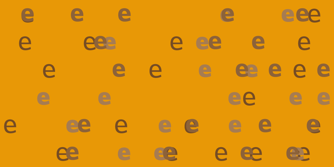
In the standard set the main figures are tabular but with a proportional old style figure set as a feature.

Traditional and stylistic ligatures are also part of the feature set. The alternate version is now a stylistic set.
Only a few near the baseline and some more at the ascenders and the upper part of the x-height. In some elements you feel the classic penstroke.
Volt is basically built on this idea. I tried to give letters like the »n« a certain dynamic by keeping the left upper part quite low and the right upper part quite high. It follows the classic penstroke. By skipping the »b« to get a »d« (of course with corrections) the element move away from the classic pen and give the x-height a certain rhythm and contrast. To calm this I tried to make all lower case letters quite static. At the end I decided to keep both version. An serious and an eccentric. In copy you should not get heavier than Heavy. Extrabold and Ultrabold work best in display.
In the standard set the main figures are tabular but with a proportional old style figure set as a feature.
Traditional and stylistic ligatures are also part of the feature set. The alternate version is now a stylistic set.