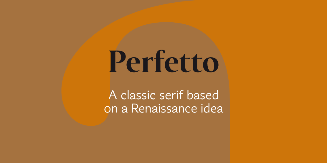

Perfetto
ArtikelID: 51 | seoTitlePre: | nameArticle: |basePath: /var/www/virtual/modula-shop-systems.de/modula-cms.de/hubertjocham.dev/htdocs
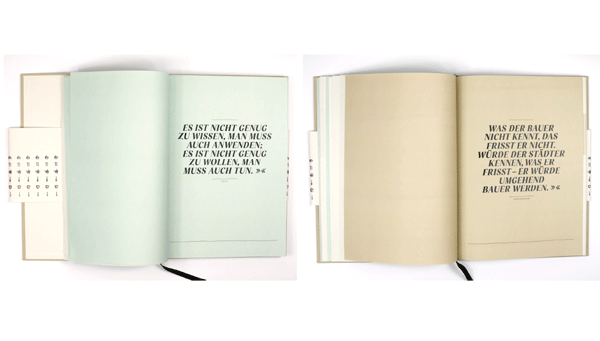
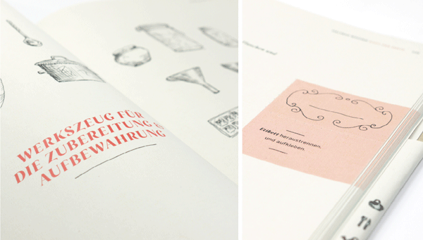
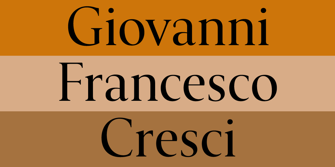
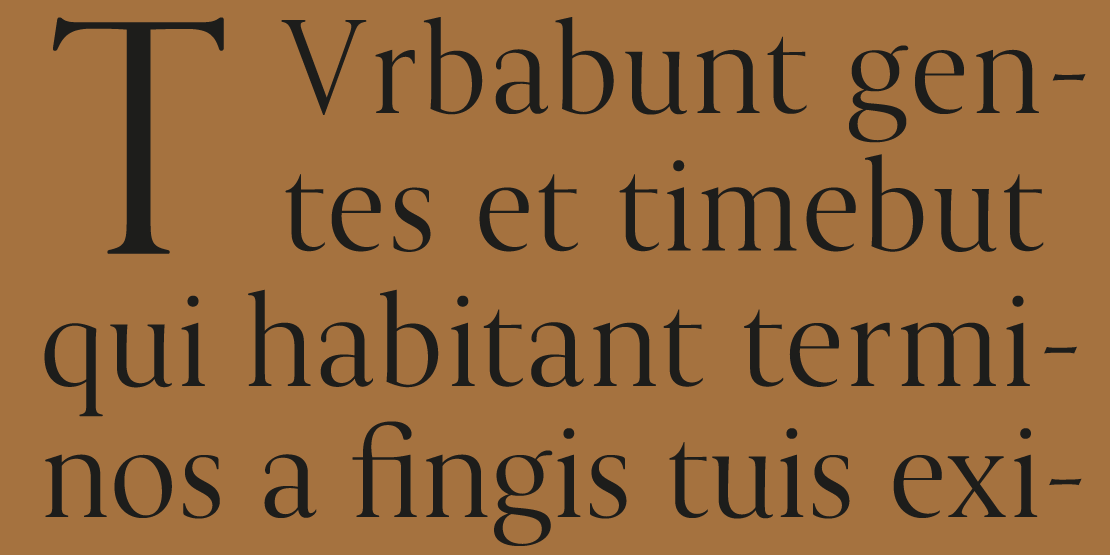
If you ask a type designer about old style he will tell you something about Aldus Manutius and Claude Garamond and maybe something about humanistic handwriting and the italic. But you would not consider the following serif as classic oldstyle. It is based on a typeface Giovanni Francesco Cresci wrote with a pen with an x-height of 8 mm. It was published in his book »Il perfetto Scrittore« in 1570. You can also see it in Tschicholds »Meisterbuch der Schrift«. The upper case letters are almost like the Capitalis Monumentalis.

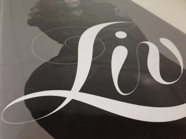
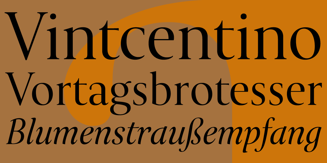
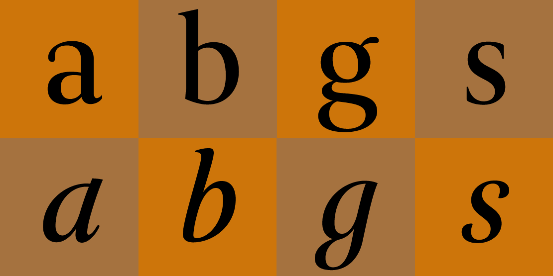
The lower case seem almost neoclassic and are very elegant. I only took the lowercase as a basis for Perfetto and wanted to keep the elegance and make a modern useful serif. I started with the display version with thin hairlines and created the text version later. The display version has 9 weights with italics up to extrabold and ultrabold.

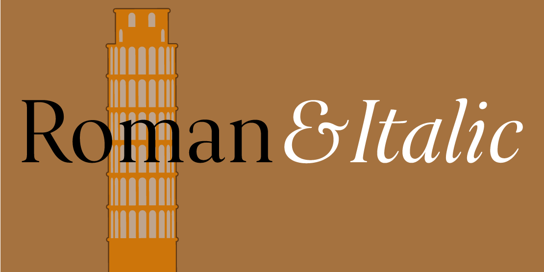
The text version has only 7 weights, because Extrabold and Ultrabold make no sence in text. The small caps are in a seperate font now.

In the standard set the main figures are tabular but with a proportional old style figure set as a feature.

Traditional and stylistic ligatures are also part of the feature set.
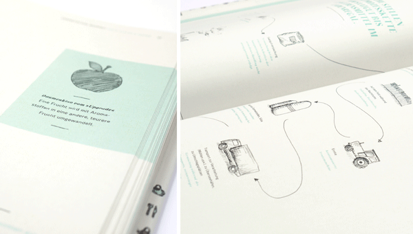
The lower case seem almost neoclassic and are very elegant. I only took the lowercase as a basis for Perfetto and wanted to keep the elegance and make a modern useful serif. I started with the display version with thin hairlines and created the text version later. The display version has 9 weights with italics up to extrabold and ultrabold.
The text version has only 7 weights, because Extrabold and Ultrabold make no sence in text. The small caps are in a seperate font now.
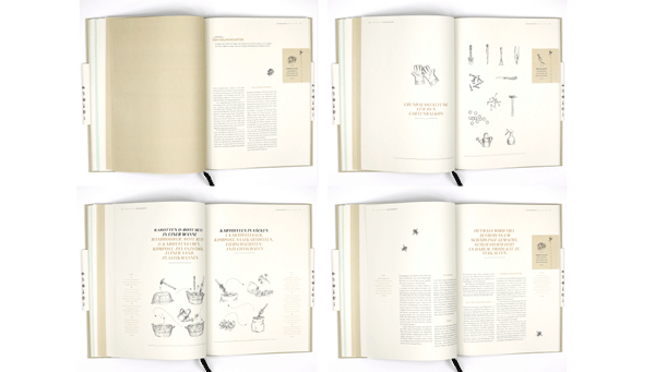
In the standard set the main figures are tabular but with a proportional old style figure set as a feature.
Traditional and stylistic ligatures are also part of the feature set.